Deloitte Digital / Item Builder UX Exploration
Deloitte Digital took on this project for an American multinational restaurant chain and international franchise. The goal of this project was to modernize, streamline, and transform the company's digital experience, ultimately improving online outcomes.
As a summer intern, my month-long contribution to this project consisted of UX research, exploration, and working closely with the company's UX Research team to formulate user testing questions. The 8+ person product team worked towards this goal with an emphasis on ease of use, a user-centered approach, and industry comparison and standards.
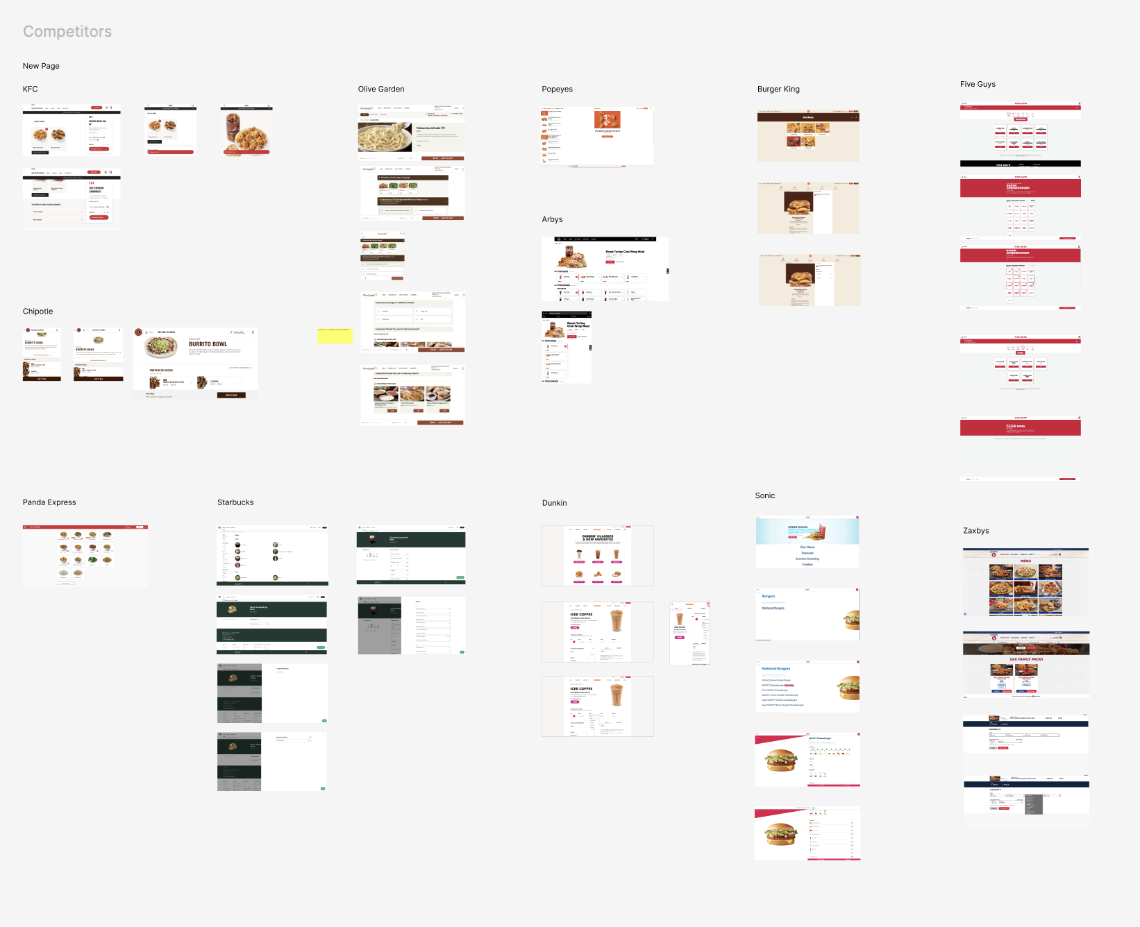
During the exploration stage, I dove into the desktop, mobile, and tablet versions of competitors' item builders and ordering systems. I facilitated a working session on side-by-side comparison, notes on key differences, approaches, and consistent design elements in order to set the stage for specific goals going forward in the item builder.
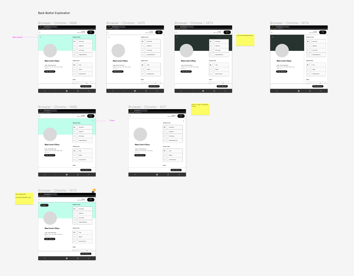
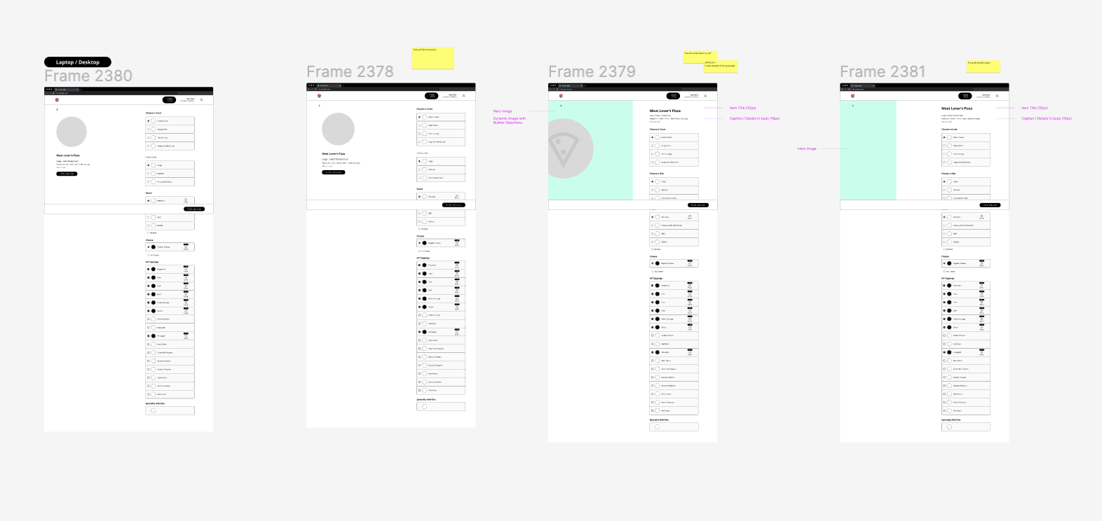
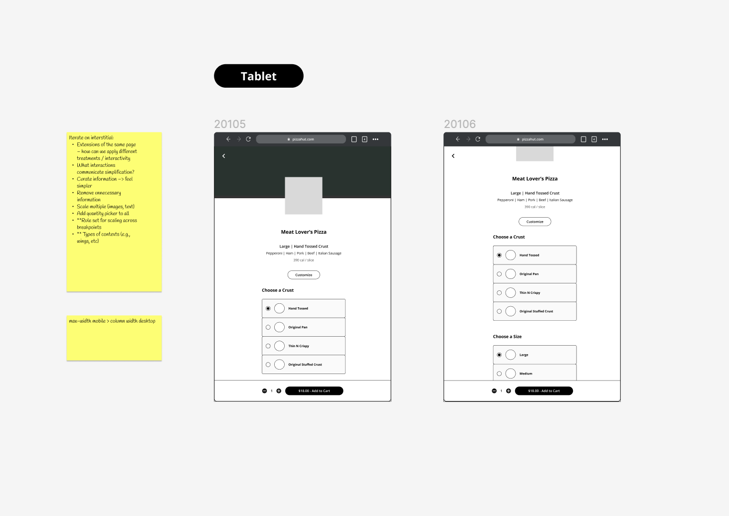
The findings from this stage were translated into comprehensive, low-fidelity prototypes in Figma.
